Customizing UI / Theming
Phase Two ships a unified theme called phasetwo-ui that covers all four Keycloak theme types — login, account, admin, and email — in a single package. It is built with Keycloakify and shadcn/ui and is the default theme on Phase Two hosted instances.
Branding is applied at runtime through realm attributes, so changes take effect immediately without rebuilding or redeploying the theme JAR. The Styles panel in the admin console (under Extensions) provides a UI for most of these settings — the Admin Portal v2 theme tokens described below are not exposed there yet. To access it, ensure the phasetwo-ui theme is selected for the Admin theme in Realm Settings > Themes.
For email branding (logo, footer), set your realm's email theme to phasetwo-ui. This unlocks the Email Branding settings described in the Emails guide.
If you are looking to build a fully custom theme, we recommend using Keycloakify. Phase Two are sponsors of the project.
The Styles panel and all branding features described on this page require the phasetwo-ui theme to be active. Go to Realm Settings > Themes and set:
- Login theme:
phasetwo-ui - Admin theme:
phasetwo-ui - Account theme:
phasetwo-ui - Email theme:
phasetwo-ui
Simple
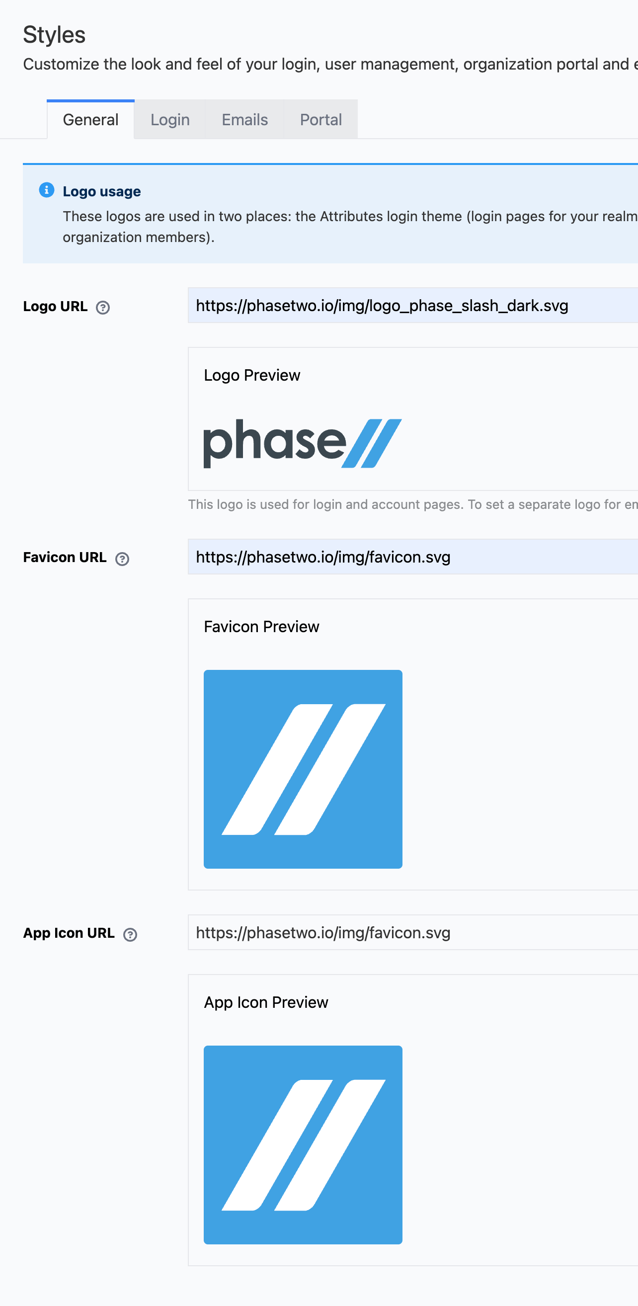
The simple override of colors and logo can be accessed in the admin UI under Extensions > Styles. The available override values are organized across four tabs.
General tab
- Logo URL: URL of your logo image. This logo appears on login and account pages. It will be constrained to 150×150px. Use an SVG or PNG with an alpha channel so it renders correctly on any background and inside the Admin Portal. To set a separate logo for emails, use the Email tab.
- Favicon URL: URL of your browser tab favicon.
- App Icon URL: URL of the app icon used within the Admin Portal.
The form includes a live image preview so you can confirm your URLs are resolving correctly before saving.
Login tab
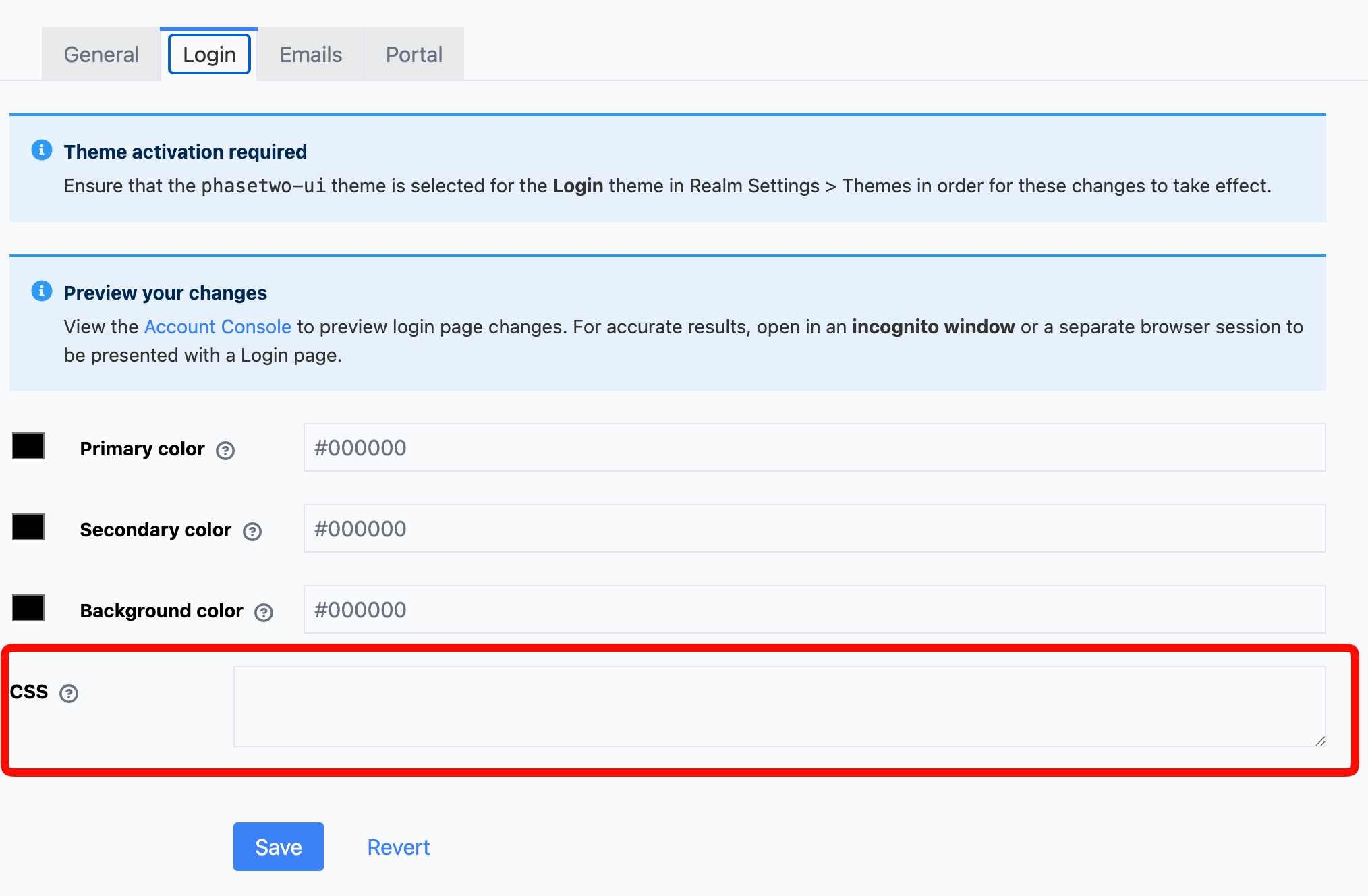
Colors control the look of the login, registration, and related authentication pages. All values are hex color codes (e.g. #3b82f6).
Light mode
- Primary color: Used for buttons, links, and the sidebar panel. Default:
#3b82f6. - Secondary color: Used for secondary accents. Default:
#60a5fa. - Background color: Page background color. Default:
#ffffff.
Dark mode
The theme automatically follows the user's operating system dark mode preference. You can supply separate overrides for dark mode; if omitted, the light-mode values are used as fallbacks.
- Primary color (dark)
- Secondary color (dark)
- Background color (dark)
A CSS field is also available on this tab for arbitrary stylesheet overrides, loaded after the theme styles.
Full CSS
The CSS field in the Login tab accepts arbitrary CSS that is loaded after the theme styles. You can use it for targeted overrides without replacing the entire theme.
The phasetwo-ui login theme is built with shadcn/ui and Tailwind CSS v4. The color system uses a set of --p2-login-* CSS variables that the theme bridges to shadcn's semantic tokens. Overriding these variables in your custom CSS is the lightest-weight way to change colors without touching the color picker fields:
:root {
  --p2-login-primary-color: #5b9fdd;
  --p2-login-secondary-color: #edf5fb;
  --p2-login-background-color: #ffffff;
  /* Text color rendered on top of the primary color (e.g. button labels) */
  --p2-login-primary-foreground-color: #ffffff;
}

/* Optional: separate dark mode overrides */
.dark {
  --p2-login-primary-color-dark: #3b82f6;
  --p2-login-secondary-color-dark: #1e3a5f;
  --p2-login-background-color-dark: #0f0f0f;
}
Phase Two has assembled a few complete custom themes. View them in our Keycloak Themes Repository.
Manually by Realm attributes
All values set through the Styles panel are stored as Realm attributes. You can set them programmatically via the Keycloak Admin REST API or in a realm export JSON. Use the following attribute keys:
General
| Attribute | Description |
|---|---|
_providerConfig.assets.logo.url | Logo URL for login and account pages |
_providerConfig.assets.favicon.url | Browser tab favicon URL |
_providerConfig.assets.appicon.url | App icon URL for the Admin Portal |
Login (light mode)
| Attribute | Default | Description |
|---|---|---|
_providerConfig.assets.login.primaryColor | #3b82f6 | Buttons, links, sidebar |
_providerConfig.assets.login.secondaryColor | #60a5fa | Secondary accents |
_providerConfig.assets.login.backgroundColor | #ffffff | Page background |
_providerConfig.assets.login.primaryForegroundColor | #ffffff | Text on primary color |
_providerConfig.assets.login.css | — | Arbitrary CSS appended after theme styles |
Login (dark mode overrides)
If omitted, the light-mode values are used as fallbacks.
| Attribute | Description |
|---|---|
_providerConfig.assets.login.primaryColor-dark | Primary color in dark mode |
_providerConfig.assets.login.secondaryColor-dark | Secondary color in dark mode |
_providerConfig.assets.login.backgroundColor-dark | Background color in dark mode |
_providerConfig.assets.login.primaryForegroundColor-dark | Foreground text in dark mode |
Email branding
See the Emails page for details on email template customization.
| Attribute | Description |
|---|---|
_providerConfig.assets.logo.base64 | Email logo as a base64 data URI (max 1MB, PNG or SVG recommended) |
_providerConfig.assets.email.footer.line1 | First footer line (defaults to realm display name) |
_providerConfig.assets.email.footer.line2 | Second footer line (optional tagline or contact info) |
_providerConfig.assets.logo.base64— base64-encoded data URI of your email logo (e.g.data:image/png;base64,...). Embedded directly in email bodies; requires thephasetwo-uiemail theme._providerConfig.assets.email.footer.line1— first footer line; defaults to realm display name when absent_providerConfig.assets.email.footer.line2— optional second footer line
Admin Portal
The Admin Portal is built on shadcn/ui components that read their colors from CSS variables. Realm branding is applied at runtime by resolving a small set of theme tokens and injecting a <style> element that overwrites those variables.
Each token is set with the _providerConfig.assets.portal.v2. prefix. Color tokens take a #rgb or #rrggbb hex value — the recommended format — and also accept bare CSS color keywords such as red or transparent and the rgb(), hsl(), hwb(), lab(), lch(), oklab(), and oklch() functions. Contrast is only measured from hex, so if you use a keyword or a color function, set the matching foreground token explicitly rather than relying on the auto-contrast described below. radius accepts a CSS length such as 0, 4px, or 0.5rem. A value that matches none of these is ignored as if it were unset.
The Styles > Portal tab in the admin console still edits the legacy keys listed further below. Set the v2 tokens with the Keycloak Admin REST API or in a realm export.
Theme tokens
| Attribute | Default | Description |
|---|---|---|
_providerConfig.assets.portal.v2.primary | #1570c2 | Brand color: primary buttons, links, focus rings, active sidebar item |
_providerConfig.assets.portal.v2.primaryForeground | auto-contrast | Text and icons on the primary color |
_providerConfig.assets.portal.v2.cta | #252627 | Emphasized neutral action button |
_providerConfig.assets.portal.v2.ctaForeground | auto-contrast | Text on the CTA button |
_providerConfig.assets.portal.v2.background | #ffffff | Page, card, and popover background |
_providerConfig.assets.portal.v2.foreground | #09090b | Default text color |
_providerConfig.assets.portal.v2.muted | #f4f4f5 | Muted, secondary, and accent surfaces in light mode, including the sidebar |
_providerConfig.assets.portal.v2.border | #e4e4e7 | Borders and input outlines in light mode |
_providerConfig.assets.portal.v2.radius | 0.5rem | Corner radius of buttons, cards, and inputs (a CSS length) |
_providerConfig.assets.portal.v2.darkBackground | #09090b | Page, card, and popover background in dark mode; the muted, accent, border, and sidebar surfaces are mixed from it |
_providerConfig.assets.portal.v2.darkForeground | #fafafa | Default text color in dark mode |
_providerConfig.assets.portal.v2.darkCta | #ffffff | CTA button in dark mode |
_providerConfig.assets.portal.v2.darkCtaForeground | auto-contrast | Text on the CTA button in dark mode |
Each token resolves independently: the v2 attribute if set, otherwise a legacy fallback — only primary (from primaryColor700) and cta (from secondaryColor900) have one — otherwise the built-in default. A foreground token you leave unset is computed for readability from the relative luminance of its background: primaryForeground from primary, ctaForeground from cta, darkCtaForeground from darkCta, and foreground / darkForeground from background / darkBackground when you set those explicitly.
Legacy (deprecated)
These keys follow the Tailwind color scale, with the lowest number lightest. They are still read, but only primaryColor700 and secondaryColor900 affect rendering — as the two fallbacks above. Set the v2 tokens to customize anything else.
| Attribute | Default | Description |
|---|---|---|
_providerConfig.assets.portal.primaryColor100 | — | Read, but no longer affects rendering |
_providerConfig.assets.portal.primaryColor200 | — | Read, but no longer affects rendering |
_providerConfig.assets.portal.primaryColor400 | — | Read, but no longer affects rendering |
_providerConfig.assets.portal.primaryColor500 | — | Read, but no longer affects rendering |
_providerConfig.assets.portal.primaryColor600 | — | Read, but no longer affects rendering |
_providerConfig.assets.portal.primaryColor700 | — | Fallback for the primary token when v2.primary is unset |
_providerConfig.assets.portal.primaryColor900 | — | Read, but no longer affects rendering |
_providerConfig.assets.portal.secondaryColor800 | — | Read, but no longer affects rendering; the CTA hover shade now derives from cta |
_providerConfig.assets.portal.secondaryColor900 | — | Fallback for the cta token when v2.cta is unset |
Custom CSS
| Attribute | Default | Description |
|---|---|---|
_providerConfig.assets.portal.css | — | Arbitrary CSS for the Admin Portal |
Custom CSS is appended last, after the generated variables, so it overrides both the tokens and the built-in defaults. Target the CSS variables (--primary, --background, --radius, and the .dark block) or standard selectors.
Custom CSS that targeted the old generated utility classes — .bg-primary-700, .text-primary-500, .bg-primary-gradient, and friends — no longer has any effect, because the portal's components now use semantic shadcn/ui classes such as bg-primary and text-muted-foreground. Migrate that CSS to the variables above. Realms that customized primaryColor100 or primaryColor900 will see neutral surfaces after upgrading — their brand color is preserved through primaryColor700 and their CTA button color through secondaryColor900 — so set the matching v2 tokens to restore custom surfaces.
Full customization details can be viewed in the Phase Two Admin Portal Repo.
Custom Themes
If you decide to use a custom theme, you must contact Phase Two support to have it added to your Realm. It is only available to subscribes of dedicated clusters.
Coming soon will be the ability to upload custom themes via the Phase Two dashboard.
Keycloakify
Keycloakify offers two methods for building custom themes:
- CSS Customization: Basic, but ok for simple changes. Learn more in the Keycloakify documentation.
- Custom (React/Angular) Components: Full customization using React or Angular components, allowing for a more robust and custom theme. If you have a theme library or set of components, you would take this route. Learn more in the Keycloakify documentation.
Ultimately what you choose depends on your needs. We have found that CSS customization of Patternfly is very difficult to get right and cover all cases. In many situations, the built in Patternfly components leave much to be desired from a UX perspective. Our friends at Keycloakify are working on a solution to this, but until that's ready we've started out providing a Shadcn starter component theme which can be used.
Shadcn is a component library that provides a set of varied and robust components that can be used to build a custom theme. It leverages Tailwind CSS for styling and Radix UI for components. The starter only handles a couple of pages, but gives a template to start from. Feel free to use it and PR additions to the templates, we would love to see them!